This chapter describes PhAB's environment in more detail, and how you
can customize it.
It includes:
Across the top of PhAB's workspace you'll see the following menubar:

PhAB's menubar.
The menus include:
- File
- Commands for creating, opening, saving, and closing applications,
(described in the Working with
Applications chapter), and
for exiting PhAB.
- Edit
- Commands for editing widgets, including cutting, copying, pasting,
transferring, grouping, and aligning. These commands also appear on the
speedbar, and are described in the
Creating Widgets in PhAB chapter.
- View
- Commands for displaying the clipboard and Control Panel.
- Options
- Allows you to set PhAB preferences, as described in the section
"Customizing your PhAB
environment."
- Application
- Commands dealing with the application as a whole (described in the
Working with Applications chapter),
and its modules (described in the Working with
Modules chapter).
- Window
- Commands that manipulate PhAB's windows.
- Help
- Access to online Help information, described in the section
"Help."
The speedbar gives you quick access to the Edit menu's commands:

PhAB's speedbar.
To find out what a button is for, pause the pointer over it. A help balloon
will appear. For more information, see the
Creating Widgets in PhAB chapter.
You can turn PhAB's speedbar into a floating window and
drag it anywhere onscreen.
The speedbar will return to its default position the next time you start PhAB.
To detach the speedbar from its default position:
- Point to a blank area of the speedbar.
- Press the mouse button and drag the bar to where you want it.
To reattach the speedbar, drag it back close to its
original position.
If the speedbar doesn't reattach when you release the
mouse, try to position it more precisely.
If you don't want to use the speedbar, you can turn it off in the
Preference Settings dialog. For more information,
see "Customizing your PhAB
environment" in this chapter.
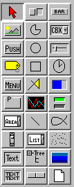
At the left side of the PhAB window you'll see the widget
bar. This bar lets you add widgets to your application.

PhAB's widget bar.
To find out what widget a button represents:
For information on using specific widget classes,
see the Photon Widget
Reference.
The widget bar has two modes:
- select mode-lets you select existing
widgets and modules in the work area
- create mode-lets you create new widgets
To find out which mode you're in:
- look at the widget bar-If the arrow icon at
the top is pushed in, you're in select mode. If any other
icon button is pushed in, you're in create mode.
- look at the pointer-If the pointer
is a single-headed arrow when you move it into the work area,
you're in select mode. If the pointer is anything else,
you're in create mode.
To switch to create mode, click on any widget icon in
the widget bar. You can now create one or more instances of
that widget.
For more information, see
"Creating a
widget" in the Creating Widgets in PhAB chapter.
To switch from create mode to select mode, do one of the
following:
- Click on the arrow icon at the top of widget bar.
Or
- Click the right mouse button in a module.
By default, PhAB returns to select mode as soon as you've created a widget.
Here's how to customize the widget bar so it displays only the
widgets you need:
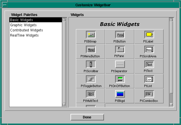
- From the Options menu, choose the Customize Widget Bar
item. PhAB displays the following dialog:

Customizing the widget bar.
- On the left, you'll see a list of widget palettes. Each
palette groups together similar widgets or widgets within a
specific library. To view any palette, click on its
entry in the list.
- On the right, you'll see the widgets available for the
currently selected palette. Any widget icon that's pushed in
is already included in the widget bar.
Each widget icon is a toggle: simply click on an icon to add
or remove that widget from the widget bar.
- After customizing the widget palette, click on Done. PhAB
immediately applies your new selections to the widget bar.
 |
The widget palette is saved to disk, so any changes you make
will be in effect the next time you run PhAB.
PhAB saves changes to the widget bar on a per-user basis
rather than by application. |
PhAB's Control Panel displays information about the currently selected
widgets.
The Control Panel is displayed by default in PhAB,
and you can move it anywhere you like.
If you close the control panel, you
can reopen it by choosing the Control Panel item from the View menu.
If this doesn't make it appear, choose Arrange Modules from the Window menu,
and PhAB will cascade all open modules and pull the Control Panel back
into the PhAB work area.
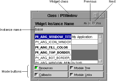
The control panel looks like this:

Anatomy of PhAB's control panel.
It includes the following:
- Widget class
- The class of the selected widget.
- Next and previous buttons
- Let you navigate sequentially through widgets in the current module.
These buttons also let you select multiple widgets
or select widgets within a group. For more info,
see the "Selecting
widgets" section in the Creating Widgets in PhAB chapter.
- Instance name
- Lets you enter a unique instance name for the widget.
 |
After entering an instance name, press Enter.
|
For more info, see the section on
"Instance
names" in the Creating Widgets in PhAB chapter.
- Mode buttons
- Let you switch between the control panel's modes:
- Resources-view and edit resources
- Callbacks-view and edit callbacks
- Module Tree-display the widget family hierarchy of the
current module
- Module Links-display a list of module links so you can see
how a module is connected to the rest of the application
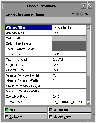
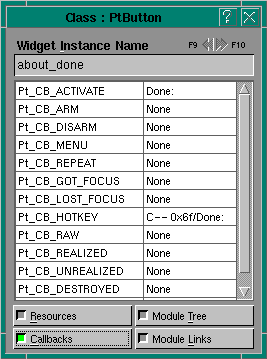
Resources mode displays a list of resources for the selected
widget. Here's an example:

Resources mode for the control panel.
To edit any displayed resource, click on it.
For more information, see the
Editing Resources and Callbacks in PhAB
chapter.
By default, the Control Panel displays resource labels
descriptively. If you pause the pointer over a resource, the header manifest
is displayed in a popup balloon.
To have the labels displayed as the actual
header manifests (convenient when writing code),
open the Preferences dialog
and change the setting in the Resource Names field.
To open this dialog, choose the Preferences item
from the Options menu.
Now if you pause the pointer over a resource, the popup balloon displays the
descriptive label.
 |
The control panel doesn't display all the resources for a widget.
PhAB sets
Pt_ARG_AREA,
Pt_ARG_DIM,
and
Pt_ARG_POS
automatically when you move or resize a widget.
Some other resources are too complex to edit in PhAB. |
Callbacks mode displays a list of callback resources for the
selected widget. You can use this mode only when
you've selected a single widget. Here's an example:

Callbacks mode for the control panel.
The left side of the list indicates the callback type. The
right side displays:
- "None" if there are no callbacks
- the callback type and name if there's one callback
- the number of callbacks if there's more than one
To create a callback or to edit an existing one, click
on the appropriate resource (for example, Pt_CB_ACTIVATE).
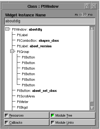
Module Tree mode displays a hierarchical tree of the widgets
in the current module. Here's an example:

Module Tree mode for the control panel.
This mode makes it easy to:
- see the parent/child relationships of the module's widgets
- select a widget inside a group
- find a widget by name
- select a widget hidden underneath another widget.
To select a widget from the tree, click on the widget's name.
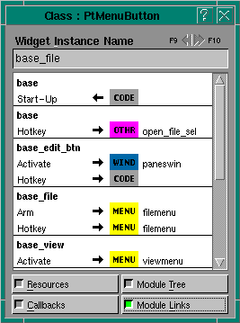
Module Links mode displays a list of all link callbacks both
to and from the current module. As you can see from the
following example, the callbacks are displayed in a two-line
format:

Module Links mode for the control panel.
| To do this:
|
Click on the: |
| Select a widget
|
Instance name
(e.g. base_file) in line 1 |
| Edit a widget callback
|
Appropriate callback type (e.g. Arm) in line 2 |
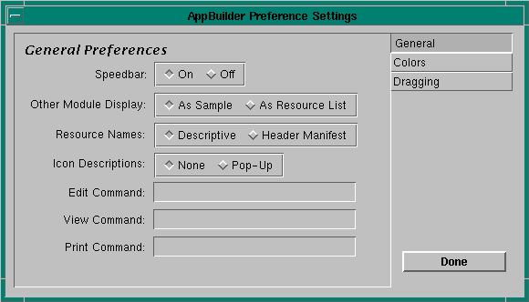
To customize PhAB to your preferences:
- Choose Preferences from the Options menu.
You'll see the Preference Settings dialog:

Setting PhAB preferences.
- Click on the button that represents the kind
of settings you wish to change: General,
Colors,
or Dragging.
- When you're finished, click on Done.
You can set the following general preferences:
- Speedbar
- Lets you specify whether the speedbar is displayed or hidden. The
speedbar is always displayed when PhAB starts up.
- Other Module Display
- Lets you choose how "other" modules
are displayed. If you prefer to see
a sample of what an "other" module will look like, choose
Sample. If you'd rather see the module's resource
values, choose Resource List.
- Resource Names
- By default, the Control Panel displays
resource labels descriptively. This field lets you
display the labels as the actual header manifests, which
you may find helpful when writing code. Note, however, that
manifests are long and take up more screen space.
If you pause the pointer over a resource, the label not displayed in
the control panel is displayed in a popup balloon.
- Icon Descriptions
- By default, when you leave the pointer on any icon, descriptive
text pops up in a balloon. To disable this
feature, click on None.
- Edit Command
- Lets you specify the editor to use with the Build &
Run dialog.
- View Command
- Lets you specify the file viewer to use with
the Build & Run dialog.
- Print Command
- Lets you specify the print command
used to print a selected file (in the
Build & Run dialog, for example).
You can set the following color preferences:
- Resize Handle
Non-Resizable Handle
- If you choose a window background that makes it difficult
to see resize handles,
use these options to customize the color. (If you select a
widget and the resize handles appear in the nonresize color, the
widget can't be resized.)
- Control Panel
- Lets you change the background color of the
Control Panel.
You can set the following dragging preferences:
- Widget
Module
- Drag widgets and modules as outlines
rather than as full objects.
- Drag Damping Factor
- The amount you must drag a widget or module before
it moves. This factor helps avoid the annoyance of moving a widget when
you really mean to select it.
There are several forms of help available in PhAB:
- Online documentation-To access the online docs for PhAB,
bring up the Help menu and choose a topic.
- Context-sensitive help-To get help on a part of PhAB's user
interface, click on the question mark button, then click on the item
in question. The Helpviewer will display the information on the
selected item.
- Balloon help-To find out what a button in the widget bar or
speedbar is for, pause the pointer over it. A descriptive balloon
will appear.
- PhAB's version number-To find out which version number of PhAB
you're running, open the Help menu and choose the About PhAB item.
To exit PhAB, do one of the following:
- Choose Exit from the File menu.
- Press
Ctrl
-X
.
- Click on PhAB's window menu button (top-left corner)
and choose Close.
- Double-click on the window menu button.


